


Split Sides
Split Sides was a very exciting project with Merce Cunningham Dance Company.
The concept was to have two independent sets of each element: two 20 minute sets of choreography, two sets of costumes, two decors (set designs), two 20 minutes musical compositions and two light designs. Before each performance and in front of the audience honored guests would roll a die to choose which of each element would be presented first and which second. There were 32 different combinations possible. I don’t know if anyone tracked the performances to see if all the combination were eventually presented.
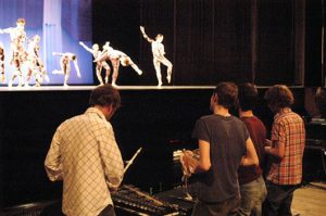
As stage manager it fell to me to announce the resulting order at each performance. Here is me doing so at BAM
This included in France where I did it in French. My French is fine, functional, but I remember saying to one of the organizers at Théâtre de la Ville in Paris “Surely there is a native francophone who can do this better than me”. “Non”, she replied, “L’accent americain…C’est mignon!”. Alors.
Weirdly, as I was googling around for Split Sides I found a recording of me doing the announcement at a performance in France, probably Paris. Maybe not so cute.
Sigur Rós in the pit
Radiohead and Sigur Rós composed music for the piece. And both bands performed on opening night at The Brooklyn Academy of Music October 14th, 2003. The hope was that for subsequent performances the music could be performed live by our company musicians. So both bands came up with a hybrid format that combined a recording with some kind of performance element. For Radiohead that meant live mixing of the performance tracks. And for Sigur Rós it meant playing a “toe shoe xylophone” that they had created for the piece. Opening night Radiohead played first followed by Sigur Ros. Click here to listen to opening night.
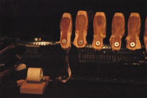
Toe Shoe Xylophone
Radiohead was the biggest band in the world at the time; along with our BAM performance they paid for their airfare from England with a couple of sold out shows at Madison Square Garden. Sigur Rós was the king of art rock. So there was a ton of excitement around these bands being part of Split Sides. Opening night was absolutely jammed; groupies trying to sneak in backstage.
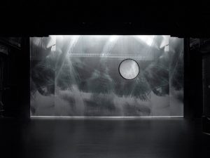
Two artists were asked to create the two decors. Catherine Yass was a typical choice for the company, she had been shortlisted for The Turner Prize in 2002. She is a photographer who, among other things, creates abstract images from photos of recognizable objects.
The second artist was a teenager named Robert Heishman from Kansas City. The company had played KC and Robert had come to one of the outreach activities. He met our executive director Trevor and shown him some of his photography work.
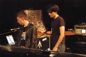
Thom and Jonny
When choosing the two artistic collaborators for Split Sides the company assembled a committee of experts. Photos of the work of a number of artists were shown to the committee blind. Most of these artists were, similar to Catherine, well established, mid career artists with good representation. But Trevor decided to slip Robert’s work into the mix just for fun. Well, this committee of experts chose Robert’s work for one of the halves.
Robert Heishman – etc
As I’ve said elsewhere one of the most interesting things that I have done a lot of is facilitating fine artists creation of work to be shown on the stage. There are a lot of special challenges with that but working with a teenager from Kansas City who had just received a call from New York to hear he was commissioned to make a work for Merce Cunningham was special. The scale of the work required and the seemingly huge budget blew Robert’s mind. He had a black and white image of power lines he wanted to use but he wanted to do more than just a flat backdrop. So in addition he came up with 4 foot round “punch out” which hung downstage on a flying pipe.
We had the backdrop and punch out printed in Germany by Gerriets. I had done a number of things with them before and always had great results. But when this backdrop showed up the black and white image had a distinctive green hue to it. Everyone was freaking out. I alerted Gerriets that they may need to do an emergency re-print and lined up an intern to fly to Germany and bring it back with them. But when Robert came into the theater he was so blown away to see his work at such a scale that the color thing didn’t even register to him. When it was pointed out he just shrugged his shoulders and said “I like it”. Poor intern.
This does illustrate one of the downsides of the way Merce worked. In a normal process a piece would be teched in some theater before it came to New York for its premiere. If there was some problem there would be time to do something about it. But if you don’t tech a piece until the day it is premiered and all the elements don’t assemble for the first time that day then you’re liable to experience some surprises.

Catherine Yass – Split sides: ¼s, 23o, 0mm, 15mph
It’s a good thing that Catherine pretty much took on the fabrication of her piece. She is very very particular about colors and would not have tolerated even the smallest variation from her ideal. She found the company Big Image to do the fabrication. It is a Swedish company with fabrication facilities in Germany. They mostly worked in large scale printing for advertising and art but were trying to get into the theatrical business. Catherine traveled to Germany to supervise the printing. In the end she wasn’t totally happy, I think that the reds were not as poppy as she would have liked. But she had found the fabricator and supervised the printing so she lived with it.

Thom, Merce, Jónsi
The thing about color on the stage is that there is also this collaborator called the light designer who can wreak havoc on your intentions. The backdrop has to be lit; at that time by quartz tungsten elements and nowadays by LEDs. Both bring a lot of attitude to the party. Light levels are constantly shifting through out the piece and there are humans in colorful outfits flinging their bodies in front of your work. So there’s a lot of competition for the eyeball. In reality you have little control of precisely how the audience will perceive your colors.
Another thing I learned was how framing works differently on the stage. On the wall a photo is framed on all sides with matt board of a color chosen to accentuate the image. In a traditional theatrical set-up a backdrop is framed by black legs on the sides and a black border at the top. The bottom is just touching the floor, like the backdrop is sitting there. Sometimes the floor is black which matches the sides and top in color nominally but not in texture. But often the floor is grey, white or some other color. So the frame around the image starts out less than ideal. Theaters are also not all the same size; so the width of the stage and hence width between the legs is variable.
I tried to explain to Catherine that some of the extreme left and right of her image would be cut off by the legs. She seemed to accept that but when we got to BAM I realized she didn’t quite understand what that meant. She spent every minute staring at the stage. When she thought there was a down moment she would ask to move the legs or change the border trim; over and over again. It got to the point where I put her directly in touch with Cy, the salty house carpenter, who was also busting my balls. It relieved my anxiety and gave me no end of pleasure to watch the two of them make each other crazy moving the legs 3″ at a time. The most amazing moment came when Catherine looked at the stage from extreme house left. She accused us of moving the framing without asking her. What she didn’t realize is that the backdrop, legs and border each are on their own flying pipe. There is space between them so they are not flat on the same plane like a photo and matt board. So the exact framing is going to change a bit depending on where one is sitting. She wasn’t happy but I think that when she realized that there wasn’t a single answer she calmed down a bit.
Which is all to say that experiencing an artwork on a stage that is but one element among many is quite different from standing in a gallery quietly regarding a perfectly matted and framed, archival print. As an artist you can make yourself crazy and ultimately unhappy or you can say to yourself “This is fucking awesome”. At the end of the day you’re going to have to come around to the latter.
This was the first time that Merce asked a fancy outside light designer to do a piece for him. Being an old school thespian Merce thought lighting makes more of an illumination contribution to the work than an artistic one. Before Split Sides the company stage manager or lighting director had always lit the works. Merce’s instructions were always “Make sure you can see the stage”. I believe there was a fight at some point over even giving credit for the lighting as a “design” but it was eventually granted. For various reasons Jim Ingalls was brought in to light Split Sides.
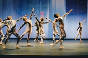
black & white costumes
Jim is one of the most widely known, best loved light designers out there. He’s done every conceivable type of stage work. He’s smart, jovial and seems to remember the names of everyone he’s ever worked with. He was totally game for the alternating two works concept. He called them the 200s series and the 300s series after their place in the cue stack. But it quickly became apparent that two totally separate light design scenarios just wouldn’t work with different decors. For example you obviously needed a spotlight to illuminate Robert’s punch-out element but if that light were randomly coming up on Catherine’s image it would just be crap. As well Catherine’s drop was printed on translucent plastic and needed to be lit from the rear, like a light box. Robert’s drop was printed on an opaque cloth which needed to be lit from the front. Not to mention the color of light to best illuminate each drop were completely different. As I recall there were some minor elements that could flip but in the end Jim basically made two designs that tracked with the decors. The production crew decided we’d keep his little fib a secret. I hope you do too.
James Hall, the company wardrobe supervisor , designed both sets of costumes. They were made of digitally printed fabric. I
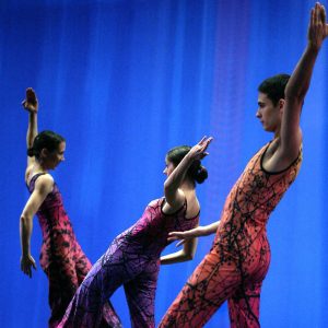
color costumes
believe it was the first time he had worked with such technology. Both sets are simply beautiful. And because they were designed, fabricated and maintained in house there was little drama with them. Thank you Betty.
Opening night was a glittering affair. Besides the bands and the groupies Mayor Bloomberg was there to officiate rolling of the dice. On hand to do the honors were Carolyn Brown (an early Merce dancer), Jasper Johns, Robert Rauschenberg and Sage Cowles (a long time friend and supporter of Merce). Merce rolled for the choreography.
The order of the program that evening was:
- Choreography: A/B
- Music: Radiohead/Sigur Rós
- Decor: Heishman/Yass
- Costumes: black & white/color
- Lights: 300s/200s
There was a fantastic opening night gala at a nearby masonic temple where we partied like (alt) rock stars.
Split Sides had a long life. After New York the piece played Paris, Seoul, London, Antwerp, Lyon, Reggio Emilia, Los Angeles, Houston, Chicago, Minneapolis, Ottawa, Montpellier, Miami, Melbourne, Berkeley, Columbus, Jerusalem and a smattering of smaller cities.

